By Tom Farmer
Screen content designers seek an Empathic balance between graphics, images, and language. But where’s the sweet spot?

Text from Colossal Cave Adventure (1975), the first known example of interactive fiction for computers. From Wikipedia.
Until the 1980s text was the only form of data most people got from computers. They didn’t have enough processing power to generate images or animations – and anyway, many users were on paper-dependent teletype-style terminals rather than screens.

Atari ASCII-View text file screen grab from the late 1980s. From Atartmania.com.
Even when screens took over for teletypes, digital text was chunky and could be hard to read. Designers naturally yearned for alternative, more visual and intuitive ways to communicate.

An early GUI from a vintage 1980s Xerox personal computer.
The graphical user interface (GUI) was a ‘70s-era brainstorm from Park Xerox, but the required computing power wouldn’t reach the public for another decade. Early attempts to balance graphics and text gracefully show what a struggle it was. But as everyday computers grew more powerful, the compulsion to favor graphical data was irresistible.
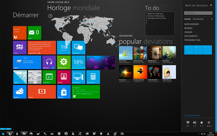
Windows 7 desktop, 2012. From DeviantArt.com.
But the tech-driven bias toward icons and moving graphics could result in cryptic, hard-to-decode information environments. Print may be in decline, but the written word is as important as ever. Users are more apt to scan and browse than dig in and concentrate, but they still read. What’s an Empathic designer to do?

Bilingual (Spanish, English) airport sign: Information, Restrooms, Departure Gates, Check In.
Information environments like airports offer useful lessons. Here’s a graphically sleek wayfinding aid presenting a blend of icons, navigational markers, and text in two languages to help global travelers along the concourse. This is the kind of Empathic balance we like to see in digital presentations. Too much of any element can overwhelm or even mystify users.

Departure information screens.
And at the airport, some forms of data can only be offered up in text form. It would be counterproductive to replace this departure board with a substitute made of icons and images. In this case, reading is quicker and easier.
So, on personal screens, what’s the optimal, Empathic balance between graphical and text assets?

Compiled by Jonathon Colman, Senior Design Manager, Intercom.
A survey of popular, effective apps by designer Jonathon Colman found the average screen contained only 36% text. 30% to 40% is a good, user-friendly sweet spot. Too much text can look too challenging; not enough can look superficial. A good Empathic team of information architects, graphic designers, and writers should collaborate to strike a great balance that attracts users.
The struggle continues! But the digital world is growing more Empathic all the time.